Your Bookstore For The Unique, Eclectic and Different
Step 4 of 4
Black-and-White-Interior Books Only
(with full-color covers)
We are constantly updating this information. Be sure to BOOKMARK this page so you don't have to go through Steps 1-3 again when you need to return here.
Do not schedule a book signing or any other event until your book has been published and until you have already ordered copies of your book, and received those copies.
ATTENTION D.I.Y. AUTHORS - After you complete the formatting requirements below, the file will need to be converted to pdf, with all the fonts embedded therein.
NEED FORMATTING HELP?
For all programs except D.I.Y., we strongly recommend you login to your author account, and upload your MSWord file to Ali for the first round of formatting. She will set your manuscript to our specs, and will send it back to you for any changes.
Important - We need the interior file of your book submitted as one file only. If your book is currently in several separate files, you will need to copy/paste the different sections into one file only, in the order you want them to appear, and upload that file for formatting.
D.I.Y. authors - you will need to upgrade if you need assistance with interior formatting. Contact Angela through your author account if you need help.
IMPORTANT! If you are using MSWord 2010/Office 2010, you *must* send your manuscript to us in "compatibility mode."
IF YOU HAVE ANY QUESTIONS ABOUT HOW FORMATTING IS DONE FOR PRINT BOOKS, look at some print books on your bookshelf. Yours won't look exactly like those (there are many types of formatting for publication), but they'll give you some ideas.
WHAT IS THE MOST IMPORTANT THING YOU NEED TO KNOW BEFORE YOU PROCEED?
First, for all programs except D.I.Y., if you make any noticeable mistakes in the interior formatting instructions below, we will fix them at no charge, or return the file to you for repair. We do not charge you anything when doing this. So, if you think you made a formatting mistake, don't worry. We can fix most errors with just a few clicks of the mouse.
But, as far as typos, grammatical errors, missing information, etc. are concerned, you need to think of P.O.D. formatting as typesetting. Once a traditional book goes to typesetting, that's it. No more editing. In other words, WYSWYG (What You See is What You Get). That's how authors need to view this process.
What We've Experienced
The primary problem many authors experience is that they receive the final copy of their book in their mailbox, start reading it, and then find errors they didn't previously notice (grammatical and spelling). One person sent us an email requesting more than 200 corrections. Another forgot to include their acknowledgements page. Still another placed dozens of low resolution pictures inside their book that came out just terrible in print. These examples (and more) are why we have these guidelines in place.
We understand that you want to see your book in print right now (we do, too!), but this is the step where you need to pause, and take a look at what is now going to be published under your name. This is the point of no return.
Why are our guidelines stringent? We've seen the print copies of books coming from other P.O.D. companies and, frankly, some of them look like they were hastily printed and bound in a garage. We won't publish and sell anything that is poorly presented. To do so would reflect poorly on you, the author, and on BookLocker. Therefore, we have high-quality expectations of our authors and ourselves.
With all programs except D.I.Y., when you upload your file during this step, we will check it, make changes, and then send it back to you for any additional changes on your end. After you make the final changes during that step, you will send your final file back to us.
Once you send that final file back to us, there is no turning back. If you request additional changes to your manuscript after it has passed through our second round of formatting, and/or has been converted to pdf, we will have to charge you a pre-print-galley changes fee ($124) because we will need to go backwards in the process, and re-do work we had already completed.
If your book has already been uploaded to the printer and you then request changes, we will need to charge a post-print-galley change fee of $224. In addition to our labor, our printer charges us more to process file revisions than they do for initial submissions. They must also ship out a new print galley to you. Making changes to print on demand books isn't as easy as fixing something in a word processing document. It takes a great deal of time to make changes and process new files, especially to add missing words and sections. Everything in the file can change and move so every page of the document must be reviewed again. The file must then be re-approved, converted to pdf, cleaned up, sent to the author for approval, and re-uploaded to the printer. They then need to process/approve the files, produce a print galley, and ship it out for approval.
Change fees must be paid up front by the author, including authors in the D.I.Y. Program. Change fees are not eligible for financing through the Payment Plan Program. Therefore, we urge you to have your manuscript thoroughly edited by a professional editor so that it's ready for formatting, printing, and publication prior to submission to BookLocker.com for formatting.
Formatting/editing changes include any corrections or changes to the formatted book that were contained in the original manuscript submitted to us in this step. A few examples of problems for which you would be charged the additional fee are:
- Typographical and grammatical errors
- Spacing errors
- Missing periods, words, graphics, etc.
- Missing or misplaced quotation marks
- Footnotes/endnotes out of place or misnumbered
- Underlines where italics should be
- Inconsistent tabs/indents/spacing and any other inconsistencies
- Lower-case letters needing to be converted to upper-case & vice-versa
- Graphics that are not high-resolution (at least 300 DPI)
Furthermore, requests to add text or sections (such as a dedication or preface), pictures, or missing or changed sentences to your book after it has been formatted will require that you pay the additional fees mentioned above. If you decide you want to submit a brand new file to use for formatting at a later date, the fees above would also apply.
Unless you are willing to pay the additional fee, anything that is submitted at this point is what will be in your book. We can't go backward once we've finished the formatting, so please ... PLEASE make sure it's correct now. By submitting your book to us per the instructions on this page, you agree that you understand these instructions and that a new fee will be charged for future changes.
IF YOU DIDN'T ORDER COVER DESIGN, AND IF YOU NOW HAVE DECIDED THAT DESIGNING A COVER ON YOUR OWN IS JUST TOO MUCH, you can hire one of our cover designers.
ORIGINAL PAPERBACK COVER DESIGN is $400. HARDCOVER IS $500. Original cover design means the designer will use pre-existing photos/graphics, supplied by the designer or the author, and will put those together with the verbiage that will appear on the cover, all to the printer's specs. Cover design does not include manual, original illustrations or artwork or photo manipulation/touch-up. Please contact Angela if you'd like a referral to a freelance illustrator/artist. You will work directly with BookLocker's cover designer to ensure your cover is perfect and you will own all rights to your cover. To see sample original cover designs from BookLocker's designer, click here. Click on each cover to see the entire cover (front, back and spine).
OKAY, ARE YOU READY?
There are two parts that you'll be submitting to us: The book's interior file and, if you didn't order cover design from us, your cover file. You're going to send us both parts via the upload link at the top of the page in your author account. But, don't send the cover yet because we won't know your final spine width until the interior file is finalized.
PART 1 - INTERIOR FILE (the inside of your book)
BODY (BOOK TEXT) SUMMARY:
NEED QUICK HELP??? For all authors other than those in the D.I.Y. Program, if you're not very experienced with word processing (and the information below confuses the heck out of you), login to your author account and upload your MSWord file to Angela for the first round of formatting. We can format books with basic formatting in a jiffy. Angela is happy to help out in any way she can. What may take you hours may take her just minutes! Remember that we need the entire interior of your book as one file only. Please do not upload multiple files. Simply copy/paste each section/chapter into MSWord in the order you want them to appear. Then, upload the file to Angela via your author account.
WANT TO SUBMIT YOUR OWN FORMATTED FILE?
You have two choices:
1. Copy/paste your interior text into the appropriate template below. If you find this distorts your text too much, try the next option (2).
2. Change the settings in your existing file to the ones listed below.
If you have questions about copyright page text, or if you are wondering about the correct order of sections in your book (copyright, dedication, etc.), go ahead and download one of the templates as they contain that info.
TEMPLATES
Please click on the file that matches the book size you've chosen. The files are in MSWord -
5 x 7 template is HERE.
5 x 8 template is HERE.
5.5 x 8.5 template is HERE.
6 x 9 template is HERE.
7 x 10 template is HERE.
8 x 8 template is HERE.
8.5 x 8.5 template is HERE.
8 x 10 template is HERE.
8.5 x 11 template is HERE.
WANT TO SUBMIT A PRE-FORMATTED PDF FILE?
Yes, you can submit your book's interior as a pre-formatted pdf file. You can either use the page and margin settings below or you can simply set your document to one of the book sizes above, use 1/2-inch margins, be sure to include an appropriate gutter (see below), and, ensure all fonts are embedded. Repeat - all fonts must be embedded.
The manuscript that you submit should be formatted as you want your book to appear in print. We can't make changes to pdf files.
NO POWERPOINT FILES - Don't use PowerPoint to create files for your book or cover. Doing so creates a host of problems and you will need to recreate the files in a different program later.
THE BOOK'S INTERIOR FILE - The templates above contain our settings. However, if you've copied/pasted your text into a template, check the settings in your file to ensure they haven't changed when you've worked on it with your book text. Be sure the settings apply to the "whole document". We prefer to receive your book as an MSWord file (from PCs or Macs) or a rich text format (rtf) document. If you are using MSWord2010/Office2010, your file must be saved in compatibility mode.
If you're using MSWord, under File and then Page Setup, choose these settings:
UNDER THE MARGINS TAB
Top: 1.0
Bottom: 1.0
Left: .5
Right: .5
Gutter .2 for a book up to 100 pages, .3 for up to 200 pages, and .35 for 300+ pages. (IMPORTANT - Next to the Pages option,be sure to click the Mirror Margins button.)
Orientation: Portrait
UNDER THE PAPER TAB
Paper Size: Choose one of the sizes in the template list above
UNDER THE LAYOUT TAB
Header: .5
Footer: .5
VERY IMPORTANT: We will fix the other settings on our end so don't worry.
ALSO VERY IMPORTANT! Turn OFF track changes! Having this on will wreak havoc during the formatting process.
NO WEIRD FONTS! We can only work with standard fonts (Times New Roman, Arial, etc.). If you include odd fonts in your book, it will be rejected or our system will automatically change the font when converting to PDF. The problem with odd fonts is that many of them were never designed to be used for print publication. Thus, our printer won't have that font and won't be able to use it. Even if we send them the font, there's no guarantee that it will reproduce nicely in print publication. Some font creators don't allow others to use their fonts in for-profit products. Therefore, to save yourself and us from headaches, please use standard fonts only.
ACCEPTABLE FONTS
Arial
Baskerville
Book Antiqua
Bookman Old Style
Calibri
Cambria
Century
Century Gothic
Comic Sans MS
Franklin Gothic
Georgia
Impact
Palatino Linotype
Papyrus
Quick Type
Segoe Print
Segoe Script
Tahoma
Times New Roman
Trebuchet MS
Verdana
This list is subject to change without notice as software upgrades can make some fonts no longer available for embedding.
NO BLANK ODD-NUMBERED PAGES, UNLESS it's the first or last page in a book. Odd-numbered pages fall on the readers' right-hand side. Unless it's the first or last page in a book, no blank odd-numbered pages are permitted.
GRAPHICS, CHARTS, AND PHOTOS
All graphics/photos must be at 300 dpi before you place them in your document. If they're not, the printer may reject your file and/or the graphics may print very poorly. Low-resolution grayscale graphics tend to print better than low-resolution photos.
Booklocker.com can't allow graphics that will degrade the quality of the book. When formatting your book, be careful to check the size of fonts appearing in your charts/tables/graphics. If you shrink a graphic to fit in the printable margin, please ensure the text and other details in the graphic are still be readable.
If you find your photos are swimming around in your manuscript (appearing to jump around but seemingly only when you're not looking at your computer screen, or when you close the file and re-open it), you will need to anchor them (see this link for details).
PRINT-VARIATIONS
You should also expect slight variations in shading of interior photos and/or other graphics (including cover graphics), and even occasionally in text. Every computer monitor displays colors/shading slightly differently and no two printers print exactly the same. You may receive a print copy with items appearing slightly lighter or darker than another copy. Repeat - you should expect slight variations because of the nature of the technology used. We STRONGLY discourage authors from using dark graphics with little contrast. These will usually print very dark and, if there aren't clearly defined areas of contrast, the image will not look good in print. All graphics should be bright and clear with plenty of contrast. Also expect slight variations in colors. For example, a very dark pink may appear as purple in print. These types of very similar colors can be difficult to discern on a computer screen.
PHOTOS AND OTHER GRAPHICS
With the exception of old photos that can't be reproduced, photos and other graphics for the interior of the book must be professional, high quality images. While even medium-quality photos/graphics often produce nicely on P.O.D. covers, they may produce poorly on the interior of P.O.D. books. A slightly dark or light or even slightly out-of-focus photo/graphic can ruin the perceived quality of the entire book. Photos/graphics should be bright (good contrast) and perfectly focused. Old photos/graphics should be cleaned up (cropped if needed, made lighter/darker, contrast adjusted, etc.) Color photos/graphics should be changed to grayscale (we can do that for you at no additional charge).
If you really want your author photo to appear on the book, we recommend putting it on the back cover. Author photos look much better on covers (and they're in color!).
IMPORTANT NOTE ABOUT AUTHOR PHOTOS: Author photos must be professional. You might be surprised to learn that some authors submit photos of themselves dressed in tank tops and/or cut-offs or sweatshirts/pants. One author submitted a photo of herself in a nightgown! Some submit author photos that feature them in, shall we say, undesirable/unprofessional surroundings. For example, one author photo showed him standing in his backyard with a garbage can in the background. Another one showed the author sitting on a sofa in a very messy living room (toys and papers on the floor, etc.). Author photos need to be extremely professional. Dress as if you are having your photo taken for a business brochure (because, basically, you are) and the background of the photo should also be professional or otherwise attractive (i.e. a solid background like at a photo studio, a warm, wooded background as opposed to a backyard with lawn furniture, etc.). The only exception is for author photos that reflect the topic of the book. For example, the author of a book on snow skiing can have an author photo of them skiing or in ski apparel. A veterinarian can be featured in their medical coat in a treatment room. The author of a book on hiking can have themselves in hiking gear standing on a mountain, etc. If you have questions about your author photo, contact Angela through your author account.
BASIC GUIDELINES FOR MANUSCRIPT SUBMISSION
- If you don't like our POD Template formatting, no problem. Simply set your page setup and margin settings to the ones specified above and submit your manuscript. Be sure to include a note telling us to leave your formatting alone. We're happy to allow authors creative control on the design of their books (with the exception of those odd fonts mentioned above). The items below are optional, but helpful if you need formatting hints.
- Please let us know if you want your book fully-justified or left-justified. When possible, we default to full justification because that looks more professional.
- Titles/Chapter Headings look nice in 14 pt. type. Body text should be at least 11 pt. type, depending on the font you choose. For example, 10 pt Times New Roman is too small but 10 pt Arial is okay. Larger fonts are fine, but please let us know if your large font size is intentional when submitting your book text. If the main text of your book (not including chapter titles) is 14 pt. or higher, your book will be considered large print and that may cause your book to be priced higher. Having a book labeled as Large Print can hurt sales. IMPORTANT: After formatting a few pages, print a page or two on your home printer so you can see the actual size of the font.
- All text must be black. No colored fonts at all though dark grays are find in graphics). Use standard fonts (listed above). Symbols inserted must also be in standard fonts. Otherwise, they need to be graphics.
- DO NOT USE TABS UNLESS YOURS IS A POETRY BOOK. Tabs wreak havoc in the formatting/conversion process. Use indents instead and please ensure they are consistent throughout the manuscript. We automatically strip all tabs from manuscripts we are formatting. For poetry, you must use tabs to move individual lines of text over if you desire an ebook edition as well.
- Do not double-space your manuscript unless you want it to appear that way in print. Our default is single-spacing so please let us know if you want different spacing. You can put a space between each paragraph if you choose, but we recommend indenting paragraphs instead and only inserting blank lines between paragraphs during a scene/topic change. IMPORTANT: Unless your book will NOT also be an ebook, you must insert symbol between scene changes. Extra blank lines will be confusing for readers and may disappear during the epub/mobi formatting and conversion processes. We like to try to save trees whenever possible and having too much white space in a book can result in wasted paper. Also, having too much white space increases the length of a book and, thus, the price. Of course, some authors of shorter books want to increase the size. A book must be at least 80 pages for words to appear on the spine. Shorter books have spines that are too small for text to be permitted. Whenever possible, authors of smaller books should take steps to increase the page count to 80.
- Please allow text to wrap naturally. Do not use the enter key in the middle of sentences because that will cause line break errors to appear when the file is set to our printer's specs. Check each page to ensure you don't have any broken lines.
- Endnotes or Footnotes are fine but they must be automated using MSWord's Endnotes function. Manually typing footnotes on a page will only wreak havoc on the formatting process. IMPORTANT: If you signed up for ebook conversion (that includes authors in our At Your Service program), you should use endnotes because footnotes will need to be converted to endnotes during the conversion process and they must all be linked. This will add quite a bit to the conversion cost. You can switch all footnotes to endnotes quite easily in MSWord.
- Table of Contents (TOC) - If you know how to create a table of contents (TOC) in MSWord, you can create one for your book (if you want one included). If you want one but don't know how to create one, include a page where you want it to appear and type "Table of Contents" at the top. That will tell us you want us to create one for you. We'll work on the book and create the automated table of contents function in MSWord. It is not customary to include a TOC in novels, especially if the individual chapters don't have titles. (TOCs with only Chapter 1, Chapter 2, etc. look really funny, and don't help the reader to navigate the book). If you don't want a TOC, leave it off. We can't include words in the TOC that don't appear in the chapter title itself. MSWord's automated TOC won't allow us to do this. It pulls information directly from each chapter title. If you want specific info. to appear in the TOC, it must appear in the chapter itself. Please do not type a manual TOC that includes phrases that do not appear in the chapters themselves.
- Index - Recommended for non-fiction, but not required. If you choose to include an index in MSWord, it must be automated. This is not a service we offer but we do have simple instructions for doing so (written by Angela, not Microsoft). Contact Angela if you need help with this or see the link below.
Style issues:
- Very important. Insert a hard page break between sections and chapters. In MSWord, put your cursor where you want the break to occur and click Insert, Break, Page Break, OK. If you don't, Adobe will make the chapters swim into each other when we convert to pdf for print publication.
- No heading styles other than the Normal style (lots of authors make this mistake, which plays havoc on our end). If you know how to create a Table of Contents, and are doing it yourself, there is no problem inserting Style preferences when doing this. Otherwise, please don't use this option in your formatting. We use the settings Heading 1, Heading 2, etc. when creating the table of contents, so please don't use the "Heading" styles in your book text unless you're creating your own table of contents.
Basic MSWord Instructions for Creating Indexes, Tables of Contents and More
- Our templates provide page numbers (we will insert these automatically if you don't, or if you do it incorrectly, at no charge, of course)
- Our templates provide header/footer instructions (we will insert these automatically if you don't, or if you do it incorrectly, at no charge, of course)
- Please no hidden fields and no hidden pages, even blank ones!
- Use the em dash (it's longer than a regular hyphen) if needed. Don't use double dashes (--) as they will separate when moved to the end of a line during formatting and pdf conversion for printing. If you haven't changed your AutoCorrect in MSWord, you can insert an em dash into your document by typing two hyphens immediately after a word and then typing another word (don't put a space in there anywhere!). The two hyphens will then change into an em dash. You can then copy and paste that wherever you need it in your manuscript. You can also use the em dash symbol available in MSWord.
- If you use the ellipse ("...") leave the three ...'s together and keep them attached to the words they're separating. Otherwise, they'll get separated at the beginning and end of lines and will look really bad later.
This is...correct.
This is . . . incorrect.
- Do not use any special formatting unless it's intrinsic to your book (e.g., bullets, special characters). The more complex your formatting, the greater the chance for errors and problems with conversion.
- Have the book display exactly as you want it to appear (e.g., bold, italic, underline). Use italics when necessary. Do not use underlines to represent italics. Go easy on the bolds and italics. If there are too many font changes in your book, readers will get a headache. Likewise, please use only one or two different fonts in your book. Books with more look messy.
- Make sure the version you send is a FINAL version before you send it (e.g., make sure you have the Dedication, Preface, pictures, etc. where you want them).
- Spell-check and grammar-check your manuscript thoroughly. Your word processing program has a spell-checker in it. You should also run the grammar-check to look for any gremlins.
- Have a professional editor go through the manuscript (e.g., proofread, look for errant quotation marks, spacing quirks, errors, etc.).
- If you're converting an ebook to a Print-on-Demand book, all hyperlinks MUST be replaced with full urls. This includes changing the blue color to black and removing the underlining of the words. It's okay if the hyperlinks are still "hot" (clickable). We just need to ensure readers of the print book can see the entire URL. The URLs need to have the http:// on the beginning of them for Adobe to recognize them as being "hot" because we will also offer a PDF version of your ebook (optional) and that will cause those links to be clickable.
- INTERIOR PICTURES, TABLES AND GRAPHS - If your book has interior pictures, tables, charts, and/or graphs that are graphics, these must be created as high resolution jpgs of 300 dpi before being embedded in your book. You also need to make sure they'll fit on your book's pages, with 1/2" margins. We can't shrink graphics nor manipulate them to fit on a printed book page as this distorts them. It might be easier to create these items directly in MSWord.
- TURN OFF THE HYPHENATION if you're using it. Including hyphens will wreak havoc later when we convert your file to pdf. Do not manually insert hyphens on lines because everything is going to swim around during formatting and conversion. Please allow lines to wrap naturally and don't use manual or automated hyphens to manipulate the line formatting.
- DONT USE SONG LYRICS unless you have obtained written permission from the copyright holder. This is almost never free. They usually charge hundreds to thousands. It's fine to use a song title but NOT to use any of the lyrics - not even a single line of them - without written permission from the copyright holder.
- DON'T USE GRAPHICS/PHOTOS that you didn't create, or that you haven't obtained written permission to use from the copyright holder.
- DON'T SCAN GRAPHICS/MAPS/PHOTOS from other books without obtaining written permission from the copyright holder.
- DO NOT USE GRAPHICS PULLED FROM THE INTERNET without obtaining written permission from the copyright holder. Many websites claim to have public domain images but most of them are in violation of copyright law. If it exists, somebody created it and they must give permission for its use. If they are deceased, that asset is passed to their heirs and they must provide permission. If you need graphics, use a place like istockphoto.com. It's not free but it's reliable and you're less likely to run into legal trouble using their material.
- When in doubt about material you didn't create, consult with your attorney.
Got all that? If not, bookmark this page and come back to us.
READY TO SUBMIT YOUR BOOK TEXT? Please login to your author account and then click the "UPLOAD FILE" link appearing at the top of the page in your account.
PART II - PAPERBACK COVER DESIGN
SKIP THIS PART IF YOU ORDERED COVER DESIGN FROM BOOKLOCKER!
If you want one of our freelance designers to create a cover for you (Costs $400.00 for original PAPERBACK cover design - but they're outstanding!), order custom cover design HERE. You can also find a link to original covers on that page.
Contact Angela through your author account if you are designing a hardback cover. While most of the info. below applies, the measurements do not.
If you order (or have ordered) a cover from our designer, you will own all rights to your cover after it is created, and can use it at your discretion, even at a different publisher or printer someday. However, if any stock art or stock photos are used on your cover, you will, of course, not own the copyrights to that artwork or those photos, but you will own the entire cover design as a whole. The designer will upload your final file to us directly so you can skip this entire step if you're having it done by one of our designers.
We are always happy to give authors the opportunity to submit their own cover design at no extra charge. Some authors want to try to do this on their own while others hire third-party cover designers. The problem with hiring outside designers is there is no licensing requirement for designers...so anybody can call themselves a cover designer. The vast majority of covers submitted to us from these designers, from authors themselves, and from friends/family of authors, are not designed to our specs. We must then reject the file and send the author a list of the errors in the file. This is, as you can imagine, very time-consuming. Some authors have submitted 5, 10 or even more incorrect cover files to us in an attempt to get their measurements and text/graphic placements correct. While our specs are very easy for professional designers to follow, people with little or no design experience may have problems with DPI, CMYK, measurements in tenths of inches or smaller, bleed, spine, etc. We can't review and reject unlimited numbers of incorrect files.
Authors will have the opportunity to submit one incorrect cover without additional charge. If it is to spec, that's fantastic. If it isn't, we will send a list of errors in the cover and they will have one opportunity to fix it without incurring a $45 Spec Check Fee. If the second file is also not to spec, we will need to charge a $45 Spec Check Fee to send the author another list of the errors in the file. This fee will need to be charged each time an incorrect cover file is submitted, after the first cover file upload, of course. The author is responsible for this fee whether they or their designer/representative uploads the files to the Company.
If you want one of our freelance designers to create a cover for you (Costs $400.00 for original PAPERBACK cover design - but they're outstanding!), order custom cover design HERE. You can also find a link to original covers on that page.
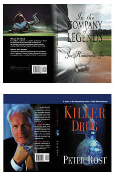
Just 2 original cover design examples. See many more HERE.
Original Cover Design means BookLocker's designer will use existing photos / images / graphics / clip art provided by you OR from his large inventory and/or membership to stock photo / graphic agencies to create your book's original cover. If you require original artwork, painted/drawn/created by an artist/illustrator, you will need to hire an artist, which may cost hundreds or thousands of dollars. If you need a list of freelance artists/illustrators, contact Angela through your author account. We strongly recommend you use a work-for-hire contract if you hire an artist so you will own all rights to the artwork, to do with as you please. Otherwise, they may limit your use of the cover in the future.
Have existing artwork you'd like included? Our designers are happy to work with you if you have existing cover art that you'd like incorporated into your cover design. However, it must be of good quality and acceptable for print publication.
If you're submitting your own cover, and are using any artwork or pictures in your cover design, you must have obtained written permission from the copyright owner to use them or you must own all rights to the photo or graphic. BookLocker reserves the right to request copies of any and all permissions obtained by the author for any graphics appearing on the cover or in the interior of the book. Using existing artwork and pictures while only citing the copyright owner is illegal. You MUST have written permission. Also, if an actual person is appearing in a photos in/on your book, you must have written permission to publish their picture (unless it is you or your own minor child).
Please remember that using pictures for which you do not own the copyright is illegal. Taking pictures from websites is also illegal. Just because something is on the Internet doesn't mean anybody can copy and paste it somewhere else. Many websites claim their images are "royalty-free" but that is usually not the case. These are simply people who are ignorant about copyright law. Somebody somewhere took that photo (or created that graphic), and owns the rights to it. If you can't find that person and obtain permission, you can't use it. Also, many websites have illegally posted photos and think they can authorize others to use them. They can't. You don't want to sell thousands of books and then get sued later by the actual copyright holder of the picture you used, or the model appearing in the picture. The penalties for copyright infringement can range from $750 to TENS OF THOUSANDS PER INFRINGEMENT and people and lawyers are only too happy to sue authors because they assume most authors are wealthy.
Have a picture of an old piece of artwork or an old painting? Again, somebody took that photo of the artwork/piece and that person owns that photo. You must obtain written permission to use it. No, you can't photocopy photos of old items from other books, nor take them from other websites or other sources, without permission from the copyright holder. Unless you went to the museum and took the photo yourself, you can't use the photo of the old item without permission from the copyright holder of the photo.
Maps - The paragraph above applies to maps and any and all other graphics as well.
ABSOLUTELY NO NUDE PHOTOS ARE PERMITTED - PERIOD.
IF YOU'RE SUBMITTING YOUR OWN COVER ART
First, please submit your book's interior file to us using the information in the section above. We will need to work on that in order to provide you with your final spine width.
Your cover must be 300 dpi or it will be rejected. You can NOT increase the dpi of an existing graphic. It doesn't work. It will only distort the graphic and make it pixelated. THIS IS THE MOST COMMON MISTAKE AUTHORS MAKE WHEN SUBMITTING THEIR COVERS TO US AND IT SLOWS THE PROCESS CONSIDERABLY. YOUR ARTWORK MUST BE SCANNED AT 300 DPI AND YOUR COVER MUST BE CREATED FROM SCRATCH AT 300 DPI.
FRONT AND BACK ARTWORK SUMMARY: Depending on the book size you have chosen, your settings for cover art will differ.
COLOR DENSITY - VERY IMPORTANT
The overall combined percentage of CMYK values of artwork must be less than 240%. For example, the 'rich black' would be 60% Cyan, 40% Magenta, 40% Yellow, 100% Black (60+40+40+100=240%). All other colors in the artwork must remain less than 240% CMYK overall color density as well.
First, your file will need to be a 300 dpi jpg or pdf file (pdf is preferred for better quality).
The cover must be a flat file. Don't submit layered files.
Covers MUST be created and submitted in CMYK, not RGB. If you submit a cover in RGB, our process will automatically convert it to CMYK and that will change the colors a bit (or, in rare cases, a lot). So, to be safe, create the cover in CMYK from the beginning.
COLOR-VARIATIONS
You should also expect slight color variations in POD covers. Every computer monitor displays colors slightly differently and no two printers print colors exactly the same. Repeat - you should expect slight color variations because of the nature of the technology used.
VERY IMPORTANT: Any words or other pertinent items appearing on your book's cover must be at least 1/2" from the edges of the trim lines! You don't want anything important to get lost in the cutting process.
Your background graphic needs to extend into the bleed. If they end at the trim lines, the slight edges would inevitable show up during the cutting process.
Text blocks on the front and back covers must be correctly centered between the spine and the trim line (unless you have them intentionally off-center for design purposes). Also, please ensure the text block is at least 1/2 inch from the trim lines and the spine for proper centering. The words on the spine must also be centered between the left and right edges of the spine and the words on the spine must also be 1/2-inch from the top and bottom trim lines.
Do NOT put your cover art inside the book's interior file. Your cover must be sent separately, as a high-resolution (300 dpi - not higher or lower) jpg or pdf file. Tif is fine, too, but those files are unnecessarily large and can take quite awhile to upload, depending on your Internet connection.
VARIANCE AND THE SPINE - The printer requires a 1/16" variance. What does this mean? During the cutting/binding process, the cover can shift one way or the other by 1/16". If your spine is a significantly different color than the rest of your cover (i.e. a white spine on a black background), this shift will be very, very noticeable because a bit of the white on the spine would show up on the front or back cover. For this reason, we recommend your spine match the background of the rest of your cover.
The printer will not offer a refund or replace books that have design elements that permit no variance.
SPINE WIDTH - If you are submitting your own cover to us, you'll need to submit your book text to us first so that we can send you the final spine size after the interior file has been finalized. However, you can estimate your paperback spine size using this formula (but you won't know the exact spine width until we have finished formatting your book). A 460-page book has around a 1-inch spine. So, if your book is, say, 152 pages, you would divide 152 by 460 to get your estimated spine width. 152 / 460 = .33 inches. A paperback book needs to be at least 80 pages to allow words to be printed on the spine. If your book is less than 80 pages, please don't include any words on the spine. If your book is under 80 pages, you should try to get it up to 80 pages, through added content or creative formatting, if at all possible.
VERY IMPORTANT: The background of the spine should match either the front or back cover background. When the spine is a different color from the front or back, the tiniest error in cutting/binding by the printer (they require a 1/16-inch variance) will be glaringly noticeable. While the printer does an outstanding job, they do print and bind thousands of books each day and expecting every employee on every shift to cut and bind each book to an exact fraction of an inch would be unrealistic. It's better to just make sure the spine background matches the front or back cover background. Don't use any design techniques that will make a fraction-of-an-inch error glaringly noticeable.
BLEED - You will need to add a 1/4" bleed all the way around the file. Per the note above, any words, photos or anything you don't want cut off during the cutting process must be at least 1/2" from the CUT edge (the trim lines). So, when adding the 1/4" bleed, these items must be 3/4" from the file's edge.
REPEAT - ALL WORDS AND OTHER PERTINENT ITEMS *MUST* BE AT LEAST 1/2-INCH FROM THE TRIM LINES.
VERY IMPORTANT. Your spine must be exactly in the center of your cover art file.
If the printer rejects your file for any reason, you will need to pay a post-print-galley changes fee ($224) for us and the printer to process new files.
COVER SIZES
Choose your book size below to find your cover size specs. Remember, during the final cut, the printer will cut off the extra 1/4" bleed that is all the way around the file. All numbers are inches.
DO NOT INCLUDE **ANY** PRINTER MARKS OR CROP MARKS. These are not necessary in the technology used by our printer and will, in fact, just get in the way, causing us to reject the cover. Please only send the cover graphic itself. Nothing else.
5 x 7
Width: 10.5+spine width
Height: 7.5
The final cut size will be 10+spine width x 7.
5 x 8
Width: 10.5+spine width
Height: 8.5
The final cut size will be 10+spine width x 8.
5.5 x 8.5
Width: 11.5+spine width
Height: 9.0
The final cut size will be 11+spine width x 8.5.
6 x 9
Width: 12.5+spine width
Height: 9.5
The final cut will be 12+spine width x 9.
7 x 10
Width: 14.5+spine width
Height: 10.5
The final cut will be 14+spine width x 10.
8 x 8
Width: 16.5 +spine width
Height: 8.5
The final cut will be 16+spine width x 8.
8.5 x 8.5
Width: 17.5 +spine width
Height: 9.0
The final cut will be 17+spine width x 8.5.
8 x 10
Width: 16.5 +spine width
Height: 10.5
The final cut will be 16+spine width x 10.
8.25 x 11
Width: 17 +spine width
Height: 11.5
The final cut will be 16.5+spine width x 11.
8.5 x 11
Width: 17.5 +spine width
Height: 11.5
The final cut will be 17.0+spine width x 11.
BACK COVER TEXT TIPS
Before you decide what you want your back cover to look like, look at a book or two on your bookshelf. The information on the back cover of a book is promotional. Make it enticing and include a hook so people won't be able to resist buying your book! People picking up your book will look at the cover first, and the back cover second. Take advantage of this space to really convince the potential buyer to buy your book. A short, extremely enticing description of your book, a bullet-point list of the most enticing content in the book (for non-fiction), perhaps snippets from some reviews (with written permission from the reviewers, of course), or even a photo (300 DPI) of you, the author, will look nice on the back cover. If you include a photo on the cover, you should also include a very short about-the-author paragraph.
HINT: Fonts with a shadow give the cover more depth while flat fonts look very plain.
DO NOT INCLUDE A BORDER/FRAME AS PART OF YOUR COVER DESIGN
Including a border/outline box/frame around the front and/or back cover design may make any tiny error of a fraction of an inch in the cutting/binding process glaringly noticeable. Straight lines along the cut of a book tend to do this where, if there wasn't a border, nobody would notice. The printer won't refund/replace books that have design elements that enhance the notice-ability of errors. The printer requires a 1/16-inch variance on covers but a straight line along the cut or fold of a book can make even a small measurement like this very noticeable. For all these reasons, we do not allow covers with outlines around the edges of the cover design.
BARCODE INFO
We will add the barcode to the back so you'll need to leave a 1.5" (high) x 2.25" (wide) blank space on the bottom, right-hand side of your back cover so we can copy/paste it in (1/2" of both measurements is to keep the barcode from being too close to the bottom or running into the spine). DO NOT MAKE THIS A WHITE BOX. Our box is already white. Leave this space the same color or pattern as the rest of your background. The barcode will be pasted by us in the blank space you leave there.
FORMATTING HELP
If you can't figure out the instructions above, contact Angela through your author account. We'll do what we can to help.